Okayama Korakuen Website
Redesigning & Redefining One of The Three Great Gardens in Japan.
LINK TO FULL XD PROTOTYPE:
Click Here
COURSE:
Interaction Design, Spring 2020
DISTINCTIONS:
Silver Graphis – New Talent 2022 Competition
NSSC’17 Best Prototyped Website
Salute Design Competition Honorable Mention for Interactive
CREDITS:
Brand Identity & Garden Map – Kristina Armitage
Navigation, Icons, Visit & Booking Pages – Ashley Owen
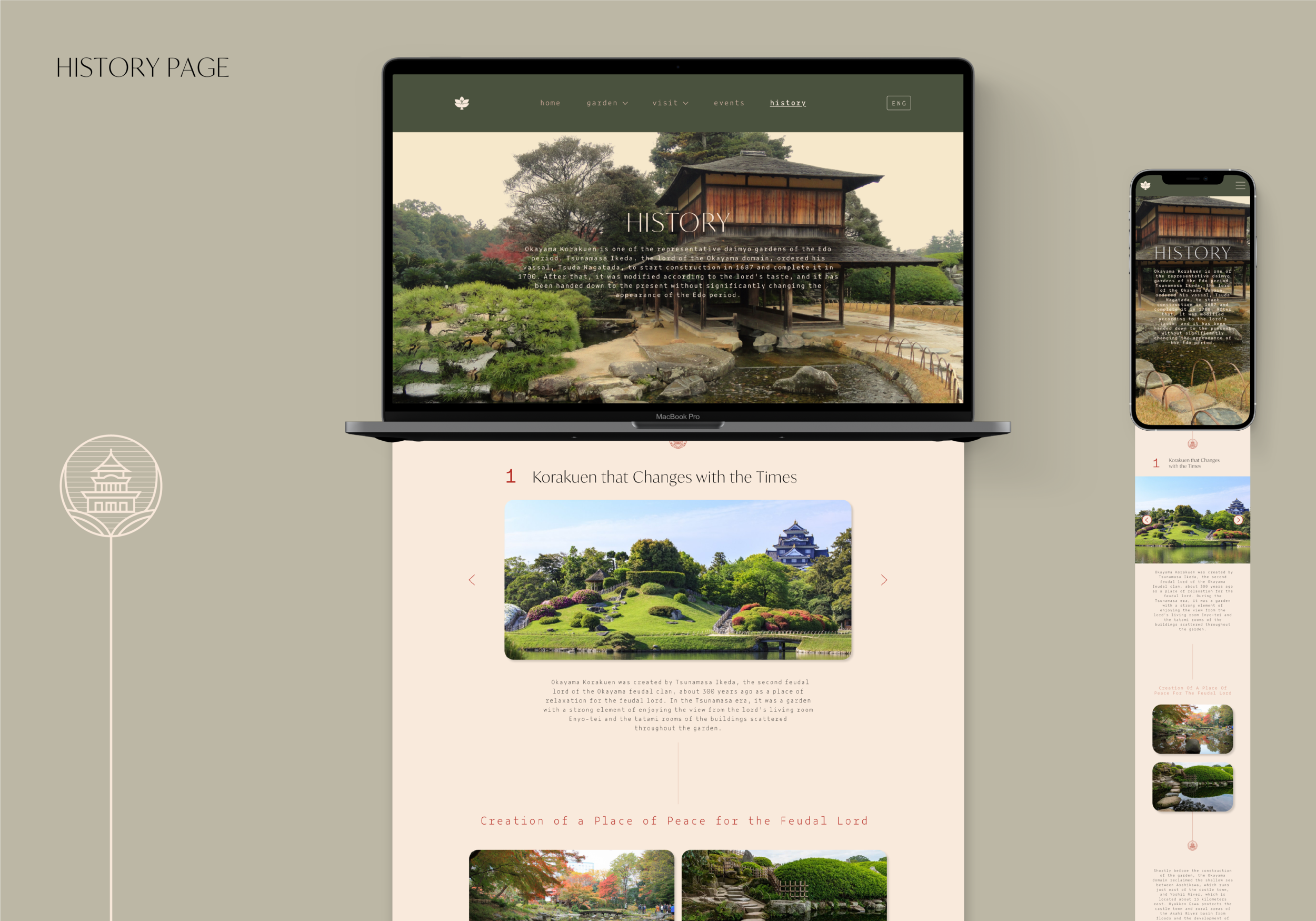
History & Events Pages – Gizel Arreola
Flora & Fauna Pages – Leena Lam
Images – Okayama Korakuen, Unsplash, or Pexels
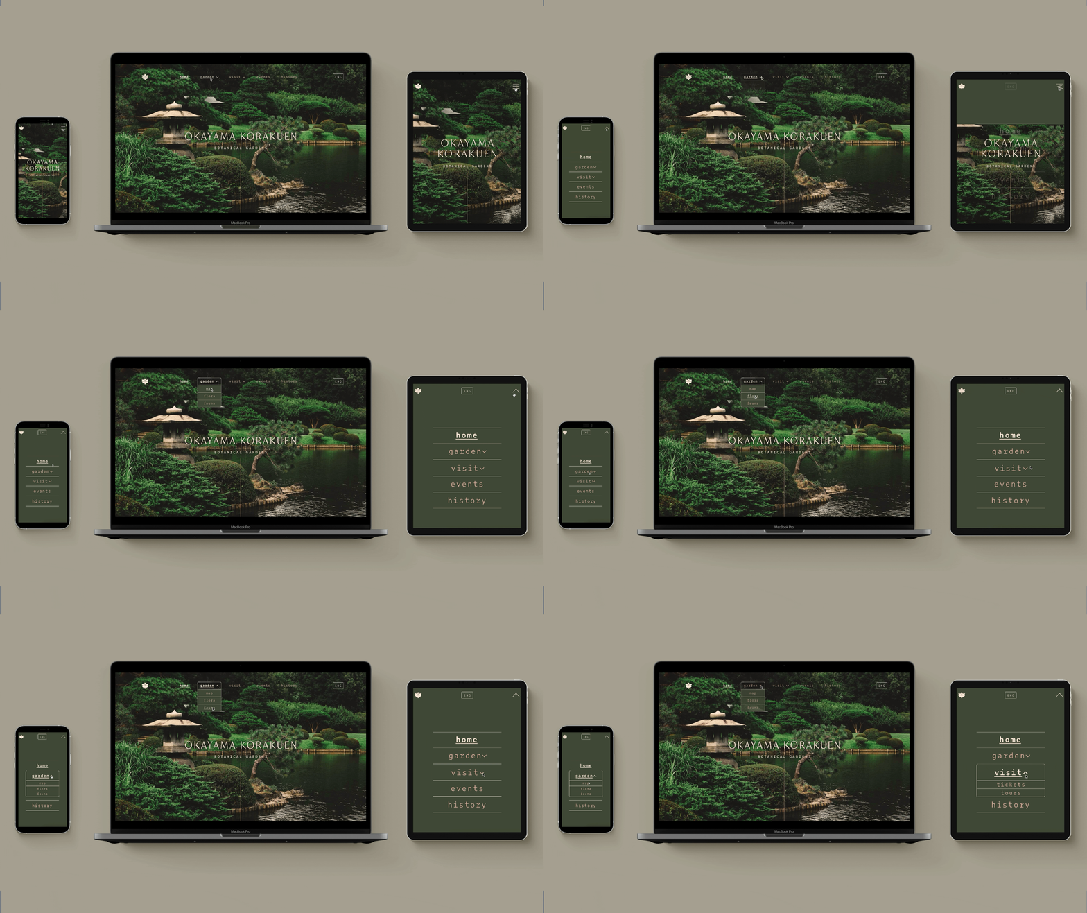
This project was designed to reimagine the website of Okayama Korakuen, one of the three great gardens in Japan. The primary goal was to identify opportunities for improvements in the garden’s current website and redesign it, refining its usability and cohesion across desktop, tablet, and mobile platforms. Starting by conducting preliminary research about areas for development in the website, we went through a strategic process of reorganizing, wireframing, and prototyping a new site and identity system for the Japanese garden.
THE ISSUES OF THEIR PREVIOUS WEBSITE
Unrepresentative of the garden’s beauty
The original website was primarily white and grey, being text-heavy with little images. It also did not establish a clear identity for the garden, making it less memorable or distinguishable for users. This was problematic because the website seemed generic and was lacking conveyance of the garden’s beautiful sites to see.
Dated design & functionality make it less user-friendly
The website seemed dated, having issues with accessibility, broken links, and pixelated images. These would frustrate the user experience and make visiting the garden even less desirable. In addition, there was no place for potential visitors to book tours or purchase tickets online despite those being offered services.


CREATING A STRUCTURE & WIREFRAMING
Before developing the final website, we underwent significant planning. After researching the garden and its competitors, we created user personas, scenarios, and flows. This, in combination with a survey analysis of how users would expect the site to be organized, facilitated us in creating a new site map which guided our design. We began sketching low-fidelity wireframes, creating digital mid-fidelity wireframes, and finally defining brand assets that would be applied across the finished website.
OUR FINAL SOLUTION
The new website design raised the overall memorability and appeal of the Okayama Korakuen, allowing users to experience its natural beauty and rich history even before planning a visit. Not only did the redesign establish Okayama Korakuen's brand, but it also improved the usability of its website through recategorizing the pages and enabling users to easily read historical information, plan visits with added ticket/booking functionality, and explore what the garden has to offer.
The visit page includes information about transportation, parking, and accessibility that helps visitors understand how to get to the garden. To further simplify the visitors experience of planning their trip, we included ticket purchasing and guide booking web pages that were lacking from the original website. These pages are accessed from the visit page and allow users to pick a date and time, select type and quantity, and enter purchasing information.


