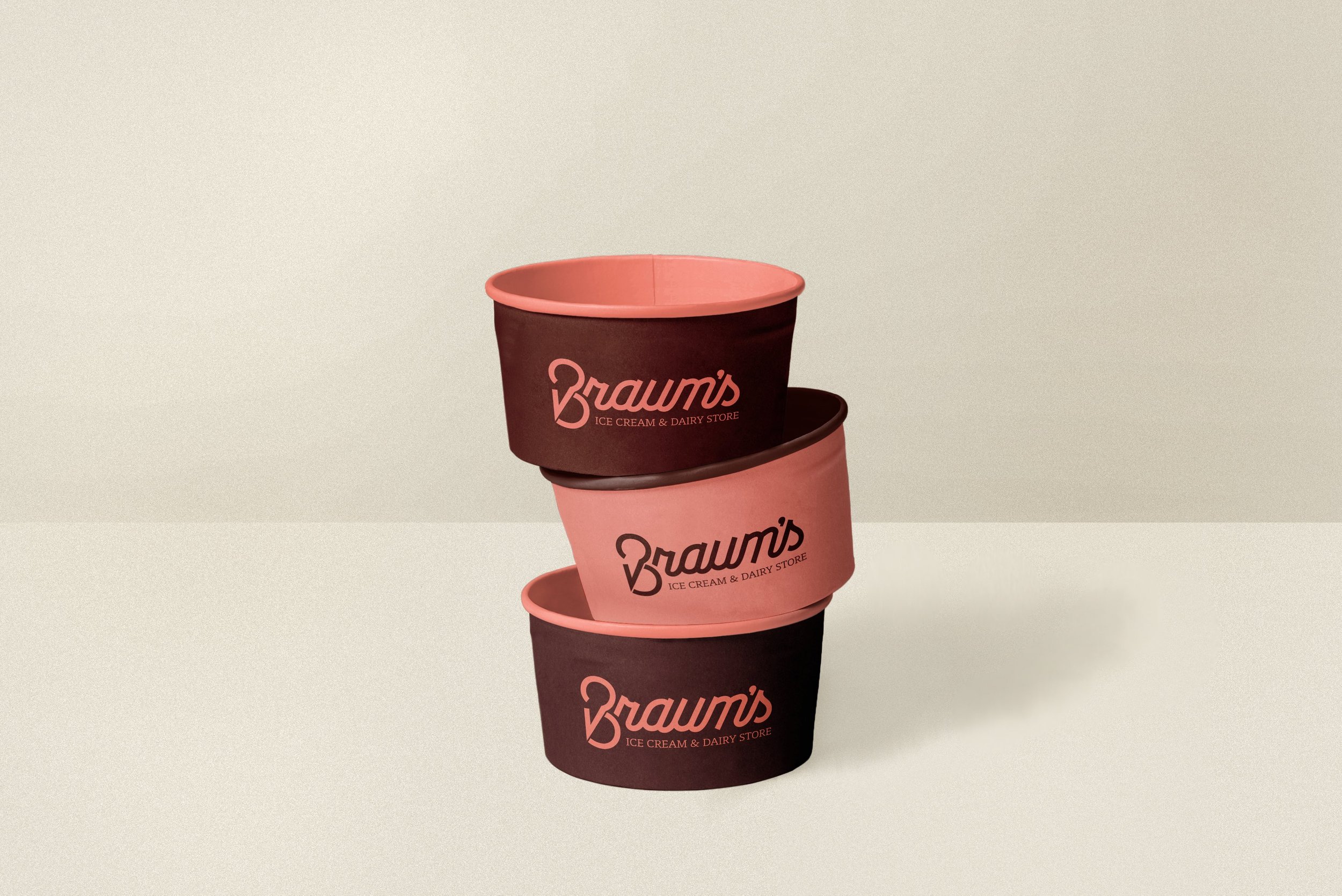
Braum’s Branding
Updating the Family Restaurant After 50 Years.
COURSE:
Packaging Design, Spring 2021
DISTINCTIONS:
Silver Graphis – New Talent 2022 Competition
CREDITS:
Images – Unsplash or Pexels
Headline on Bag – Braum’s
From its humble beginnings in 1968, Braum’s has always focused on community, aiming to bring home-cooked meals to anyone’s table. Since the brand has been the same for 50 years, this new identity and packaging design update the store’s image, making it more modern and exciting but still maintaining its family-oriented, farm roots that have been a primary aspect of its identity.
RETAINING THE BRAND’S VALUES & HISTORY
“Braum’s is your stop for family fun over ice cream, catching up over lunch with friends, or gathering with neighbors for a bite to eat.”
One of the goals guiding this project was to maintain the brand’s core family values, and the final identity system allows customers to have an enhanced experience with the brand. The new look respects the background of Braum’s but also transforms it into a contemporary ice-cream parlor, helping it suit modern trends and preferences of both customers and competitors. It makes the restaurant’s packaging and interior more exciting, creating an atmosphere that customers of all ages can enjoy – from ice-cream craving children to family-oriented adults.
“We’re just making it easy to bring that home-cooked meal feeling to your table [using] quality, local ingredients, prepared with care.”
It was important to emphasize one of the competitive advantages of Braum’s which is that it sources many of its products from its farm, using them in meals and selling them in the restaurant’s grocery. The rebranding represents this farming aspect of Braum’s using an abstract, friendly language. The happy farm animals, warm color palette, and geometric patterns are applied to both the restaurant’s packaging and interior design. These visuals reflect the kind nature of Braum’s and the love they put into their homemade products, making the brand more welcoming for visitors.
MODERNIZING THE LOGO
To uphold the restaurant’s history, it was crucial to maintain its signature ‘B’ and ice cream cone in its logo. The new logo utilizes the shape a B to form the ice cream, modernizing the original mark. The “B” can also be used as an individual mark separate from the full logotype, assisting brand recognition for those who were familiar with the single B from the previous branding.


The brand refresh coincided with alterations to the interior of the restaurants, creating a seamless brand experience for customers across the channels of interaction. Assets such as employee uniforms and a wall mural illustration help solidify the brand’s new identity. The goal was to reinvigorate the restaurant and make it more entertaining – Braum’s wants to make eating at their establishment enjoyable for the whole family, and that was the guiding vision behind the interior.


